Making user interfaces
Vectarine has a built-in UI module to make interfaces, like menus, setting screens, inventories, etc. It is designed to be very customizable to match the feel and style of any game.
Widgets
Section titled “Widgets”In Vectarine, a UI is made up of widgets. A widget is a rectangular area of the screen that can draw itself and react to user input.
All widgets have 2 properties: a size and a draw function.
The most basic and powerful widget is the Generic Widget also known as “widget”. You give it the draw function and a size and then you call the draw function to draw it.
local Ui = require("@vectarine/ui")
local Graphics = require("@vectarine/graphics")
local Vec = require("@vectarine/vec")
local Vec4 = require("@vectarine/vec4")
local V2 = Vec.V2

-- Create a generic widget of size 1x1 that draws a red square
local redSquareWidget = Ui.widget(V2(1, 1), function()
    -- The drawing function of a widget assume that the widget is drawn at (-1, -1)
    Graphics.drawRect(V2(-1, -1), V2(1, 1), Vec4.RED)
end)

function Update(deltaTime: number)
    -- Clear the screen
    Graphics.clear(Vec4.BLACK)
    -- Draw the widget
    redSquareWidget:draw()
end
With such a simple example, you might not see the point of using a widget, you could just call the drawing function directly.
However, widgets start to make sense when you compose them together.
Rows and Columns
Section titled “Rows and Columns”The row widget displays a list of widgets horizontally, while the column widget displays them vertically.
local Ui = require("@vectarine/ui")
local Graphics = require("@vectarine/graphics")
local Vec = require("@vectarine/vec")
local Vec4 = require("@vectarine/vec4")
local V2 = Vec.V2
--- Create 3 widgets
local redBox = coloredSquareWidget(V2(0.3, 0.3), Vec4.RED)
local greenBox = coloredSquareWidget(V2(0.3, 0.3), Vec4.GREEN)
local blueBox = coloredSquareWidget(V2(0.3, 0.3), Vec4.BLUE)
--- Create a row with a red, green and blue box, and another row with a blue and red box
local row1 = Ui.row({}, {redBox, greenBox, blueBox})
local row2 = Ui.row({}, {blueBox, redBox})
-- Create a column to display the two rows one under the other
local column = Ui.column({}, {row1, row2})
function Update(deltaTime: number)
Graphics.clear(Vec4.BLACK)
column:draw()
end
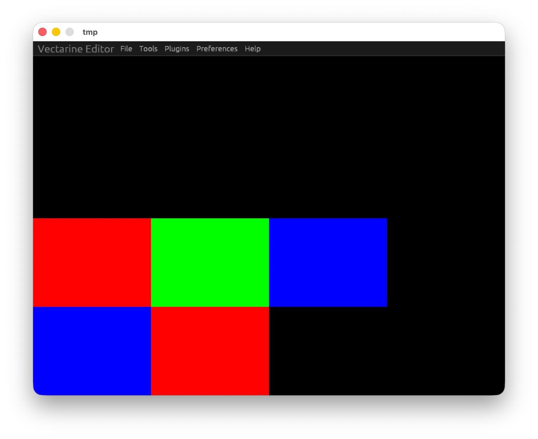
Using rows and columns, we can layout widgets in a flexible way on the screen.
The first argument of the row and column widget are options that allow you to center the widgets, add padding, spacing, etc.
For example, if we want to center the second row and add some spacing between the widgets in the first row, we can do this:
--- Omitted imports and coloredSquareWidget function for brevity
--- Create 3 widgets
local redBox = coloredSquareWidget(V2(0.5, 0.5), Vec4.RED)
local greenBox = coloredSquareWidget(V2(0.5, 0.5), Vec4.GREEN)
local blueBox = coloredSquareWidget(V2(0.5, 0.5), Vec4.BLUE)
-- Add some space between the squares in the first row
local row1 = Ui.row({ gap = 0.1 }, { redBox, greenBox, blueBox })
-- Add some space around the squares in the second row
local row2 = Ui.row({ padding = 0.1 }, { blueBox, redBox })
-- Center the rows horizontally.
local column = Ui.column({ align = "center" }, { row1, row2 })
function Update(deltaTime: number)
Graphics.clear(Vec4.BLACK)
column:draw()
end
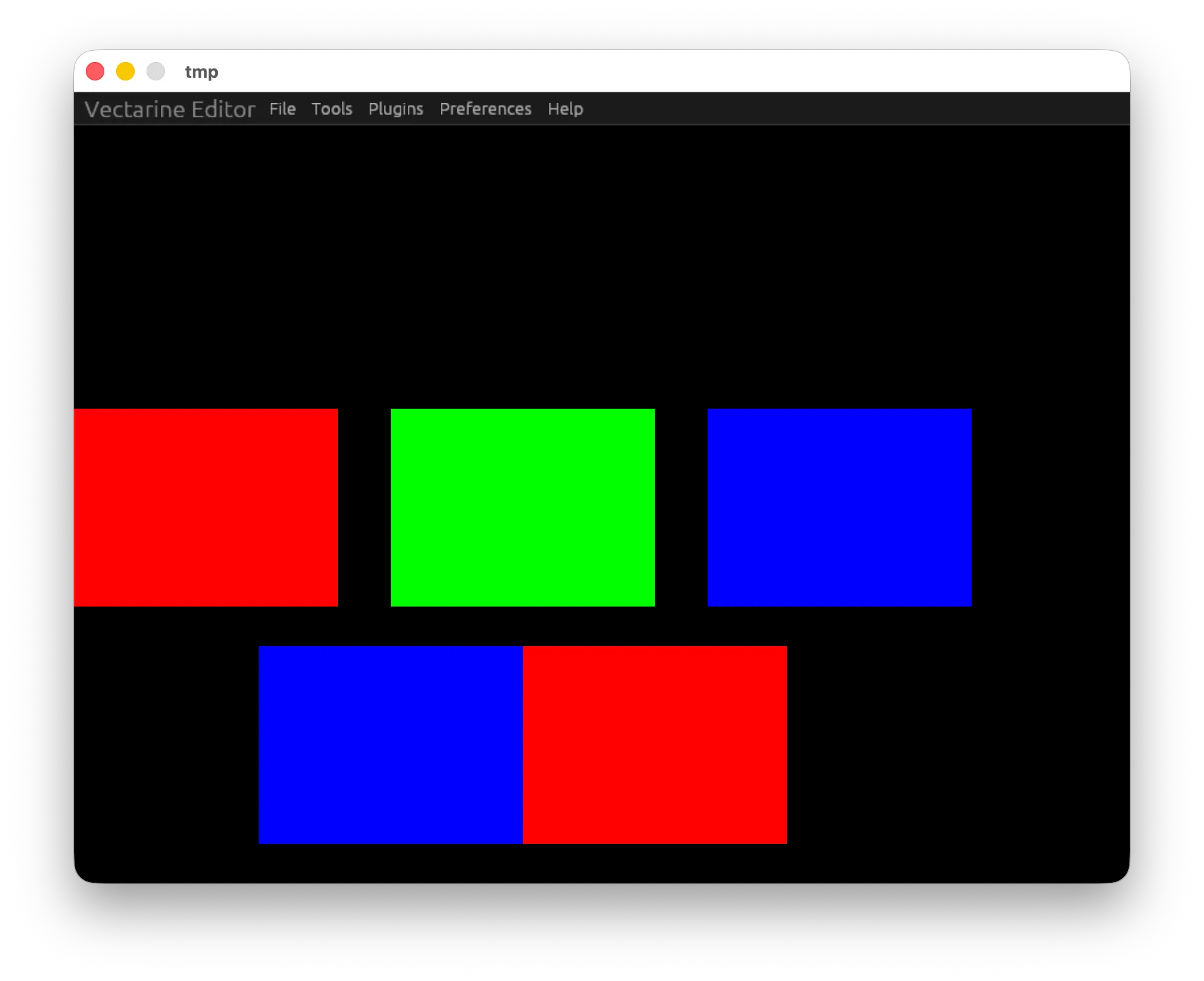
By composing rows and columns, you can make any interface you want.
Displaying text and images
Section titled “Displaying text and images”To display text, you can use the text widget. It takes a table with text and a color property and displays it on the screen.
--- Omitted imports
-- Create a text widget
local firstLine = Ui.text(V2(0.4, 0.1), {}, { text = "Hello, Vectarine!", color = Vec4.WHITE })
-- Create another text widget. Instead of passing a string, you can also pass a function that returns a string
-- This is useful to make the text reactive as we'll see later.
local secondLine = Ui.text(V2(0.4, 0.1), {}, function()
return { text = "Another line of text", color = Vec4.WHITE }
end)
local column = Ui.column({ padding = 0.1 }, { firstLine, secondLine })
function Update(deltaTime: number)
Graphics.clear(Vec4.BLACK)
-- Displays Hello, Vectarine! Another line of text (split on two lines)
column:draw()
end
The text inside the text widget will try to be as big as possible while fitting inside the widget.
You can use it for titles, buttons, or any other text you want to display.
The image widget is similar to the text widget, but it displays an image instead of text.
--- Omitted imports
local imageButtonResource = Loader.loadImage("textures/button.png")
local imageWidget = Ui.image(V2(0.5, 0.5), imageButtonResource, {
-- This will make the image use 9-slice-scaling with a border of 20% of the size of the image.
-- This can be use to display buttons at any size without distorting the corners of the image by stretching the middle parts.
nineSlicing = 0.2
})
You can pass options to the image widget to preserve the aspect ratio, set a color tint, or use 9-slice-scaling.
Stacking widgets
Section titled “Stacking widgets”Often you want to display some text above an image, for example a button with a background and some text. More generally, you might want to display two widgets stacked on top of each other. For this, you can use the stack widget.
--- We assume that the imageButtonResource exists and the required modules are imported
local buttonBackground = Ui.image(V2(0.5, 0.5), imageButtonResource, { nineSlicing = 0.2 })
local buttonText = Ui.text(V2(0.5, 0.1), {}, {text = "Click me!", color = Vec4.WHITE})
-- Widgets in a stack are drawn in order, from first to last, so the button text needs to be the last in the list
-- to be drawn on top of the button background.
local button = Ui.stack({}, { buttonBackground, buttonText })
function Update(deltaTime: number)
Graphics.clear(Vec4.BLACK)
button:draw()
end
If all of the element of the stack do not have the same size, you can use the “alignX” and “alignY” options to choose the relative alignment of the widgets in the stack.
-- If the text is smaller than the button, the text will be centered vertically on the button, but aligned to the left.
local stack = Ui.stack({ alignX = "start", alignY = "center" }, { buttonBackground, buttonText })
Reacting to user input
Section titled “Reacting to user input”User interfaces are not very useful if you can’t interact with them. To allow interaction, you can use a generic widget:
--- Omitted imports
local hoverableWidget = Ui.widget(V2(0.5, 0.5), function(eventState: Ui.EventState)
-- The event state contains information about user interaction with the widget:
-- If the mouse is clicking it, hovering it, etc.
-- In this example, we change the color of the widget to red when the mouse is hovering it.
local color = if eventState.isMouseInside then Vec4.RED else Vec4.GRAY
Graphics.drawRect(V2(-1, -1), V2(0.5, 0.5), color)
end)
Because widgets can be composed, you can add interactions to existing widgets:
-- Let's assume that you have an existing widget defined somewhere.
local existingWidget = ...
local interactiveWidget = Ui.widget(existingWidget.size(), function(eventState: Ui.EventState)
-- Add a blue background when the mouse is down on the widget
if eventState.isMouseDown then
Graphics.drawRect(V2(-1, -1), existingWidget.size(), Vec4.BLUE, 0.05)
end
-- Draw the existing widget
existingWidget:draw()
end)
As changing the text of a text widget is very common, the text widget has a built-in way to react to user input:
local textWidget = Ui.text(V2(0.5, 0.1), {}, function(eventState: Ui.EventState)
-- The text of this widget changes when the mouse is hovering it.
-- You could also change the color for getting various effects.
local text = if eventState.isMouseInside then "Hovering!" else "Not hovering"
return { text = text, color = Vec4.WHITE }
end)
Conditional rendering and dynamic UIs
Section titled “Conditional rendering and dynamic UIs”Vectarine widgets are immutable. This means that once they are created, they cannot be changed. For example, you cannot add a new child to a row or change its alignement properties. If you want to do that, you need to create a new widget and draw it instead of the old one.
Vectarine is designed this way to reduce bugs and make it easier to think about UIs.
You can think of a UI as a function that takes some data (your game state) and returns a widget tree that gets drawn.
If you need conditional rendering, you can use an if statement inside a generic widget. However, you need to pass information to the drawing function of the widget to be able to create this condition:
local Ui = require("@vectarine/ui")
local shopWidget = createShopWidget()
local inventoryWidget = createInventoryWidget()
local myWidget = Ui.widget(V2(1, 1), function(eventState: Ui.EventState)
-- We want access to the game state here, but we need to be inside the drawUi function to do that!
if gameState.insideShop then -- Error: gameState is not defined
shopWidget:draw()
else
inventoryWidget:draw()
end
end)
function drawUi(gameState)
myWidget:draw()
end
To solve this issue, the draw function takes an extra argument that can be anything:
local Ui = require("@vectarine/ui")
local shopWidget = createShopWidget()
local inventoryWidget = createInventoryWidget()
local myWidget = Ui.widget(V2(1, 1), function(eventState: Ui.EventState, gameState: GameState)
-- We add gamestate as an extra argument
if gameState.insideShop then
-- We propage the state to the children that might need it.
shopWidget:draw(gameState)
else
inventoryWidget:draw(gameState)
end
if gameState.refreshShop then
-- You can rebuild widgets on the fly if needed.
shopWidget = createShopWidget()
end
end)
-- As myWidget takes a gameState argument, its type is Widget<GameState>.
-- This allows you to still have autocompletion inside the draw function of generic widgets.
function drawUi(gameState: GameState)
myWidget:draw(gameState)
end
The extra argument is propagated to all the children of row, column and stack widgets, so you can access it anywhere.
Debugging UI
Section titled “Debugging UI”You can use the Ui.withDebugOutline function to draw a red transparent outline around widgets when they are hovered.
This can help you understand what widgets are taking space and debug issues with layout and alignment.
Ui.withDebugOutline(function()
myWidget:draw(gameState)
end)
Advanced example: Animating the size of a widget on hover
Section titled “Advanced example: Animating the size of a widget on hover”Let’s say that we want to increase the size of a widget when the mouse is hovering it. Let’s see how to do so.
local Persist = require("@vectarine/persist")
local Ui = require("@vectarine/ui")
local Vec = require("@vectarine/vec")
local Vec4 = require("@vectarine/vec4")
local V2 = Vec.V2
local Graphics = require("@vectarine/graphics")
-- The base widget that we want to animate
local baseWidget = Ui.stack({ alignX = "center", alignY = "center" }, {
Ui.widget(V2(0.6, 0.1), function()
Graphics.drawRect(V2(-1, -1), V2(0.6, 0.1), Vec4.RED)
end),
Ui.text(V2(0.5, 0.1), {}, { text = "Hover me!", color = Vec4.WHITE }),
})
-- In a real project, this will probably be part of a larger game state.
local animationState = Persist.onReload({ scale = 1 }, "animationState")
local baseWidgetSize = baseWidget:size()
-- Animated widget will draw the base widget with a padding of 0.05 and will be responsible for animating
-- its size when the mouse is hovering it.
local padding = 0.05
local animatedWidget = Ui.widget(baseWidgetSize + V2(padding * 2, padding * 2), function(eventState: Ui.EventState)
-- If the mouse is hovering the widget, we increase the scale, otherwise we decrease it.
if eventState.isMouseInside then
animationState.scale = math.min(animationState.scale + 0.01, 1.5)
else
animationState.scale = math.max(animationState.scale - 0.01, 1)
end
-- Widget are like any other drawn objects and can be transformed with Graphics.withTransformation.
-- We translate here so that the rescale is centered on the base widget.
local translation = (V2(-1, -1) + baseWidgetSize:scale(0.5)):scale(1 - animationState.scale) + V2(padding, padding)
Graphics.withTransformation(
{ scale = V2(animationState.scale, animationState.scale), translation = translation },
function()
baseWidget:draw()
end
)
end)
function Update(deltaTime: number)
Graphics.clear(Vec4.BLACK)
-- Remember to draw the animated widget instead of the base widget.
animatedWidget:draw()
end
Wrapping up
Section titled “Wrapping up”Vectarine has more widgets including a scrollable area and sliders, but they all work the same way: you pass options, children and you draw them.
For example, here is how to create a slider widget and display its value:
local Graphics = require("@vectarine/graphics")
local Ui = require("@vectarine/ui")
local Vec = require("@vectarine/vec")
local Vec4 = require("@vectarine/vec4")
local V2 = Vec.V2
function coloredSquareWidget(size: Vec.Vec2, color: Vec4.Vec4): Ui.Widget
    return Ui.widget(size, function()
        Graphics.drawRect(V2(-1, -1), size, color)
    end)
end
local sliderValue = 0
local slider = Ui.slider(V2(0.5, 0.1), {
min = 0,
max = 1,
initialValue = 0,
onChange = function(newValue)
sliderValue = newValue
end,
}, coloredSquareWidget(V2(0.5, 0.1), Vec4.BLUE), coloredSquareWidget(V2(0.1, 0.1), Vec4.RED))
local firstLine = Ui.text(V2(0.4, 0.1), {}, { text = "Hello, Vectarine!", color = Vec4.WHITE })
local secondLine = Ui.text(V2(0.4, 0.1), {}, function()
return { text = "Slider = " .. tostring(math.round(sliderValue * 100) / 100), color = Vec4.WHITE }
end)
local column = Ui.column({ padding = 0.1 }, { firstLine, secondLine, slider })
function Update(deltaTime: number)
Graphics.clear(Vec4.BLACK)
column:draw()
end
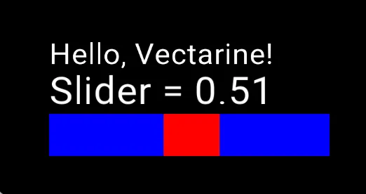
Remember that a widget = a size + a draw function.
If you need to create a custom widget, use a generic widget and compose it with existing widgets or simply draw the custom graphics you need inside.
Have fun making interfaces with Vectarine!